
How to Animate Scatter Plot Charts in PowerPoint
PowerPoint may not be the best tool for data visualization, but it is a powerful tool for storytelling. And if you know how to use animations and transition effectively, PowerPoint can be an enormously effective tool for giving highly engaging data-driven presentations.
I’ve written a few posts recently about how to animate charts in PowerPoint, as applying such tactics can bring a live presentation to life and help your audience understand the data and story you’re trying to tell. If you haven’t read my other posts yet, you can read this article to learn about animating bar and line charts and this article to learn about animating pie charts in PowerPoint.
In this article, I wanted to share a technique for animating a slightly more complex chart in PowerPoint: a scatter plot.
What is a scatter plot?
Like most charts, scatter plots visualize data across two axes (x and y), but some notable characteristics make scatter plots unique. They are typically used to visualize the relationship between two continuous variables. For instance, you might use a scatter plot to explore the relationship between household income and monthly expenditure, or household size and selling price, or body mass index (BMI) and blood pressure.
Overall, scatter plots are incredibly versatile and can be applied to a wide range of use cases. For example, a scientist could use a scatter plot to investigate the relationship between variables in an experiment. On the other hand, a business leader could use a scatter plot to explore the market positioning of a list of vendors they might be considering. Gartner’s magic quadrant methodology (pictured below) is an excellent example of the latter.
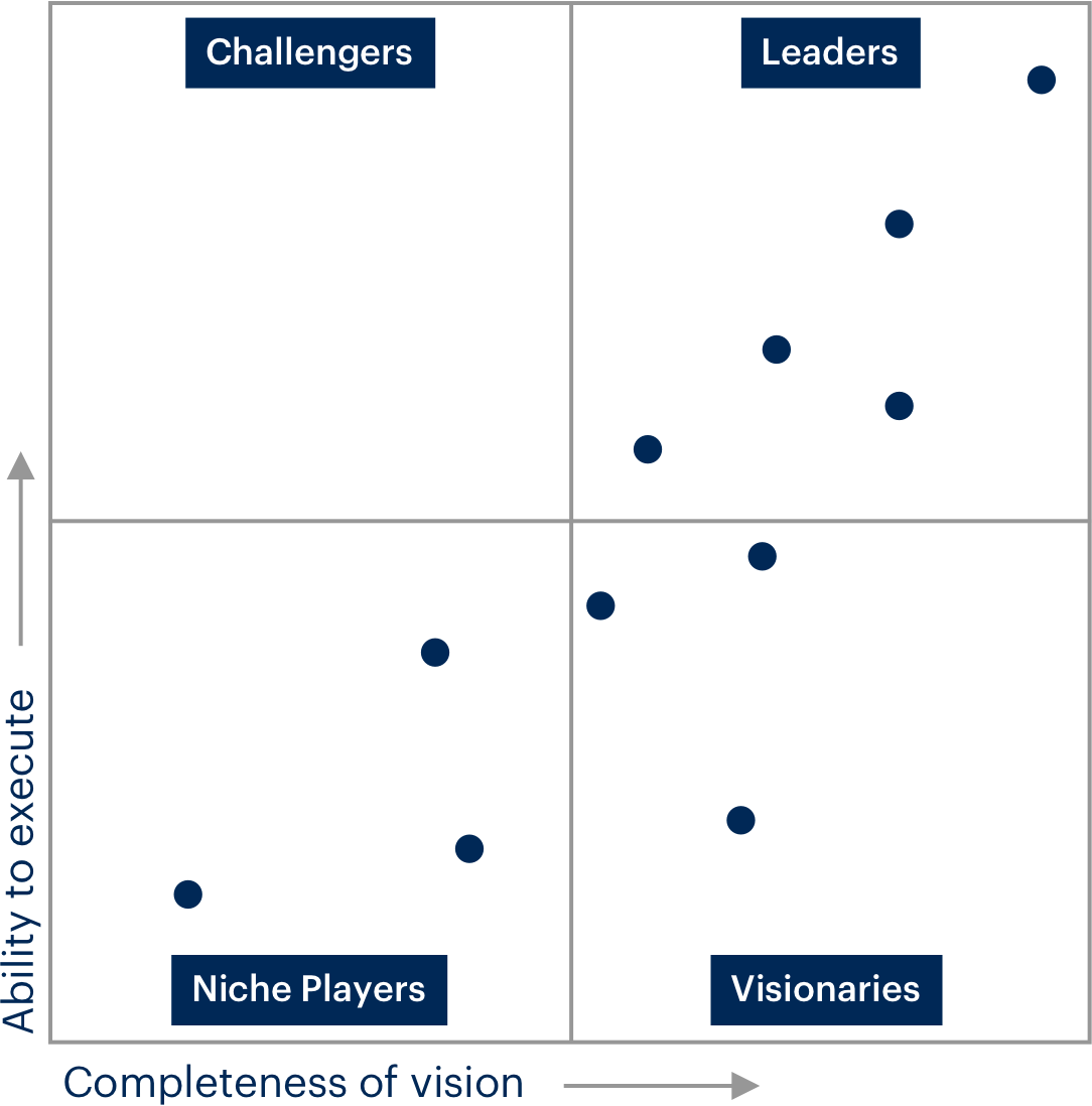
Source: https://www.gartner.co.uk
One of my favourite applications of scatter plots can be seen in the late Hans Rosling’s Gapminder presentations. Rosling was, in my opinion, one of the greatest visual storytellers of all time, as he had a unique ability to break down complex issues and topics, and present them in a highly visual way that anyone can understand. His statistical visualization tool, Gapminder, uses scatter plots to explore relationships between demographic, economic and social data, such as lifespan and income.
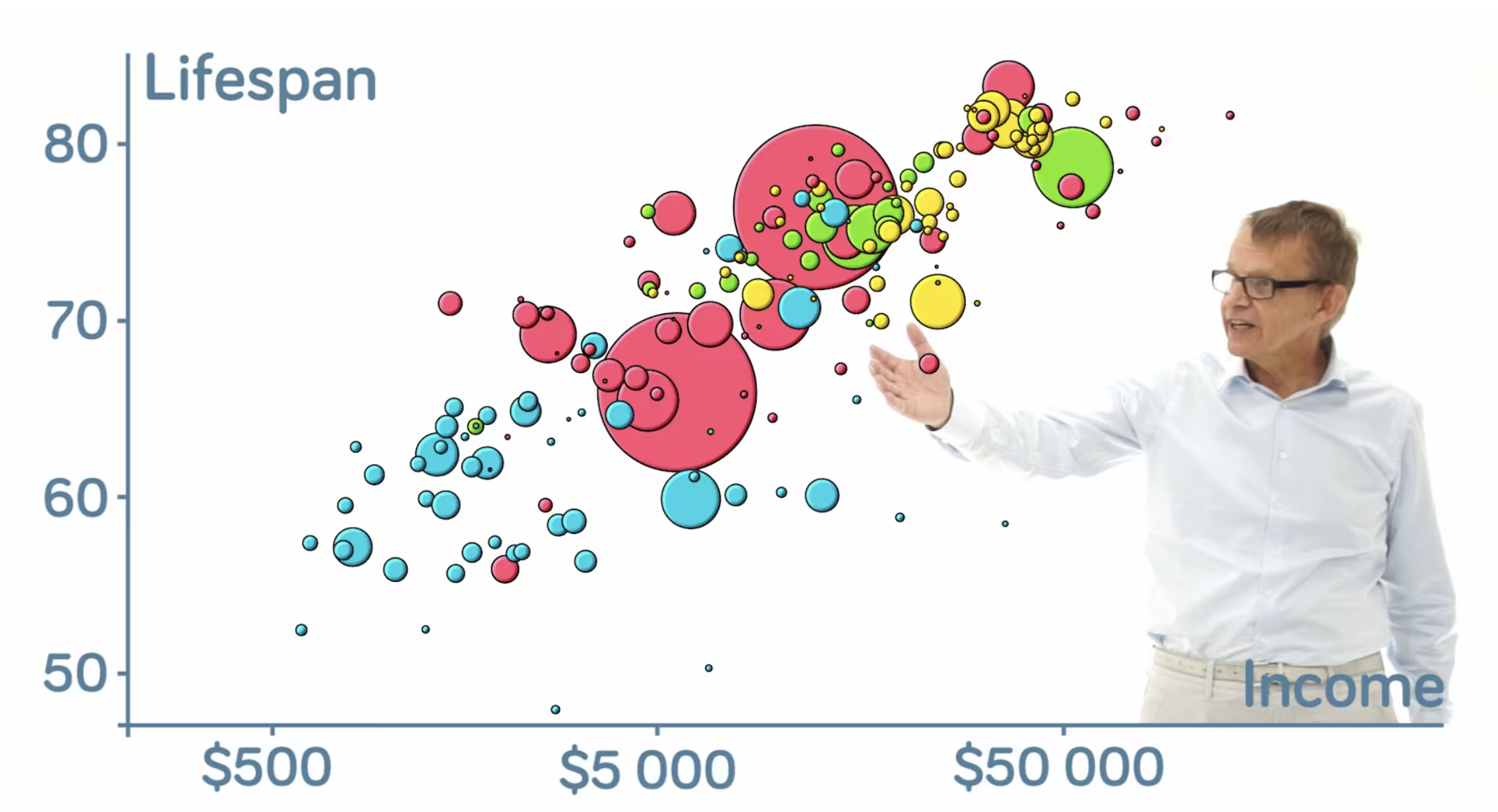
Source: https://www.gapminder.org
But what made Rosling’s presentation special was the use of animation. Scatter plots are typically fixed in time, which makes it challenging to show how the variables change over days, months or years. But with Gapminder, Rosling accomplished time-based insight by stitching together snapshots of the scatter plot for each time interval (i.e. year). The result is a highly engaging chart animation that demonstrates how the data changes over.

I’ve always had a passion for data visualization and storytelling. Over the years, I’ve re-created Rosling’s Gapminder animation several times to tell visual stories using data. And in this article, I wanted to show a technique for how you can achieve a similar animation to Rosling’s Gapminder, but in PowerPoint.
Animating scatter plots in PowerPoint
Before we get into it, I want to caveat that there are easier ways to animate scatter plots via other, more advanced Dataviz software. Many BI tools or visualization libraries like Power BI, Flourish or D3, for example, allow you to create fully interactive and animated charts. Flourish actually have a pre-made chart types called animated scatter plot, that will allow you to create a Gapminder-like presentation in minutes.
But sometimes, we have to give data-focused presentations in widely accessible tools like PowerPoint. In such circumstances, pulling up a dashboard in Power BI may not be practical in a live presentation setting. So, if you’re planning to give a live presentation with charts, and you’re looking to animate a scatter plot, this guide is for you!
Before we get into the walkthrough, let me showcase the result. Here’s what the final animation will look like in PowerPoint.

I’ve also created a video walkthrough of this tutorial. So if you’re rather watch a video than read, you can check out the video below.
Step 1 - Download the data
For this guide, I’ll be visualizing global population and demographic data sourced from the World Population Prospects 2022 (WPP) website, which is run by the UN Department of Economics and Social Affairs. I’ve prepared an XLS file that you can download via the link below if you want to follow along. The file below includes the original raw dataset I downloaded from the WPP website, some data tables that I prepared, as well as the scatter plot charts that we’ll need to paste into PowerPoint.
We will be using a scatter plot to visualize three variables, which include:
Population size (shown as the size of the bubble)
Life expectancy (shown on the x-axis)
Crude birth rate (shown on the y-axis)
I’ve also chosen a shortlist of 12 countries from the original WPP data file, as visualizing 190+ countries would make the chart difficult to read. Here are the 12 countries I’ve shortlisted:
Australia
Canada
China
Japan
Malaysia
Philippines
Portugal
Spain
Switzerland
Thailand
United Kingdom
United States of America
Step 2 - Create charts in Excel
Before we get to PowerPoint, we must create the scatter plots in Excel. You will need to create a single scatter plot for each time interval (e.g. year) in our sequence, then we’ll use the morph transition in PowerPoint to animate the data. Since we have to create a snapshot of the chart for each time interval, you should consider how many intervals you need. In Rosling’s Gapminder videos, he sometimes shows as much as 100+ years of change. Using this method, 100 years of data would require you to produce 100 charts. This would obviously be very time-consuming to build in PowerPoint, so I recommend having fewer intervals.
In this example, I’ve used just three time intervals across a 70-year period, including 1950, 1985, and 2020. In the downloadable XLS linked above, you will find a worksheet called Tables & Charts, which includes the scatter plot charts, as well as three tables I prepared with the tabulated data (i.e. table 1 contains the population size, life expectancy, and crude death rate data for 1950, and so on).
If you’re unfamiliar with creating scatter plots in Excel, you will need to ensure you have the correct cell ranges selected for the x-axis, y-axis and bubble sizes. Below are the settings I’ve used for the scatter plots, where population is shown as the bubble size, crude birth rate is shown on the y-axis and life expectancy is shown on the x-axis.
One thing that’s very important is that the x and y axis min and max range is exactly the same across all three charts. The x and y values vary quite a bit across the three intervals (i.e. 1950, 1985 and 2020), and Excel will default to different max values. So you will need to ensure these are consistent.
You can adjust the axis by selecting the chart, then Format on the top ribbon, then click the dropdown menu on the left side and select Horizontal (Value) Axis. From there you can adjust the axis min and max under Bounds from the format pane. Once this is done you can adjust the y-axis by selecting Vertical (Value) Axis in the dropdown menu.
Step 3 - Paste charts into PowerPoint
Once you’ve created all your charts, you can transfer them to PowerPoint. Copy each chart in Excel, then in PowerPoint click Edit > Paste Special and choose Picture (SVG). Do this for each chart you’ve created, pasting each chart as an SVG onto a new blank slide.
Step 4 - Ungroup the charts
Returning to the first slide, right-click on the pasted chart and select Group > Ungroup. A window will appear asking if you want to convert the image to an MS Office drawing object; click Yes. Now right-click again and select Group > Ungroup once again, and your chart will now be separated into individual objects.
Note that you need the chart to be ungrouped for the morph transition to work properly.
Follow step 4 for all of the remaining charts.
Step 5 - Apply morph transition
Now that you’ve converted all of the charts to objects and ungrouped them, you can simply apply a morph transition to each of the slides from chart 2 onward.
That’s it, you’re ready to present!
Some formatting tips
This technique is relatively straightforward, as we’re essentially converting charts to MS drawing objects and then leveraging PowerPoint’s morph transition feature to create our animation. That said, the formatting you apply to the chart will make or break your presentation, so you should carefully polish and format your charts.
One thing you can do is format the background chart elements one time, and then replicate this for all the other charts / years. That way, you don’t have to re-format the background chart elements for every chart that you have.
Another thing to look out for is the size and placement of your converted charts. When you paste the chart as an SVG it will paste the chart in the centre of the slide, and it will be the same size for every chart from when you first paste it. That said, if you resize any of the charts or changes the relative placement of the chart on your slide canvas, this will cause issues with your animation. So take care to ensure your charts are placed and sized consistently. This is why I suggest you follow the first tip above, and create a base chart background (i.e. axis bars and labels, gridlines, etc) that you paste across your slides.
And finally, although I mentioned this earlier, I wanted to reiterate that you must ensure the X and Y min and max ranges are identical for every chart in your animation. If you forget to set this manually, Excel will likely apply different ranges to each chart, which means the axis values will change as your chart animates. So don’t forget this when creating your charts.
You can download the PowerPoint template I used in this tutorial using the link below.
I hope this walkthrough was helpful, and happy charting!
