
How to Animate Pie Charts in PowerPoint
Following my last post about animating charts for live presentations, I received a few questions asking how to animate pie charts in PowerPoint. So I wanted to share some tips on how you can do this as a way to give more engaging data-driven presentations.
But first, in case you haven’t read my earlier post, Animating Charts in PowerPoint, please go give it a read, as it covers a wide range of chart types.
In my earlier post about animating charts in PPT, I mainly used the wipe animation (with some configuration of the effect options) to reveal or highlight sections of your chart. When it comes to pie charts, a similar effect can be achieved by using the wheel animation.
To do this, first add your pie chart, select it and apply the wheel animation. Then go to Effect Options and change the Sequence to "By Category.”

You can also change the animation Start (under Timing) to be based either on On Click if you want full control, or After Previous if you’d rather have the animation play out automatically. Once this is setup it will look something like this.

The animated chart above looks ok, and if you need a quick fix, then this will probably work. But I think we can do better. And after some toying around, I created something that looks and feels a little more compelling. Here’s what the revised pie chart animation looks like.

I think this version is much more visually enticing, and it gives you the ability to tell a more impactful story when giving a live presentation. That said, this approach will involve a few extra steps to create the full effect.
Let me walk you through how I’ve created this animated pie chart. I’ve also provided the PowerPoint template at the end of this article. So if you want to skip the walkthrough and get your hands on the PPT template, feel free to skip to the end.
Steps to create the pie chart animation
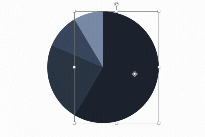
You’ll start by creating a regular pie chart in PowerPoint. In my example, I’ve created a pie chart using fictional data, based on a survey that asked respondents about their preferred type of vacation (i.e. relaxing, adventure, foodie or other styles of vacations). Don’t forget that pie charts display compositional data (i.e. the parts need to add up to a whole). So don’t use pie charts with the wrong type of data.
We’re going to be using morph transitions to achieve the desired effect shown above. But morphs only work well when the shapes or objects across slides are the same. For example, if you add new objects or change the shape of an object across slides, then the morph transition will just look like a crossfade, instead of an animation. Also, the morph transition doesn’t work so well with charts. So what we’ll need to do is convert the pie chart to an object.
To do this, select your chart, copy it, then select Edit > Paste Special. From this window, select Picture (SVG).

Select your newly pasted picture, right click and select Group > Ungroup.

After clicking ungroup you will see an alert that asks if you would like to convert the picture to a Microsoft Office drawing object, click yes.
Your pie chart has now been converted to objects, which gives us a little more control over the individual slices of the pie. So you can now select any slice/object and resize it, change the colour, etc.

We can now start building our animations and transitions. To replicate the animation shown above, I’ll need to create a few different slides. One slide for the starting position, which shows the full pie (with a different colour pallete), then one slide for each slice of the pie. And I have one final slide at the end that shows the full pie chart again. So we’ll create six slides in total.

On the first slide (i.e. the full pie), select all the slices of the pie and add a zoom animation. Keep the first object animation set to start On Click. But for all subsequent object animations, set them to start After Previous. Also, change the duration for all animations to 0.25.
Next, let’s work on the animation and formatting for the first slice of the pie. Replicate (copy and paste) your first slide, and delete all of the animations that were carried over. You can now play around with the formatting of the pie chart to highlight the first slice. I did this by creating some distance between the slice in focus and the rest of the pie, and I coloured all of the other slices to a light grey. The reason for the latter was to keep the audience focused on one slice of the pie, rather than having their focus spread across the entire pie chart.
In addition to the pie chart formatting, I also added the chart slice data label and call-outs. These were accomplished by adding the text and arrow connector, and then adding animations to each of these elements. The first text to appear (i.e. 58%) is set to start With Previous, so it starts automatically once the slide loads. Then the arrow connector and the text “Prefer relaxing vacations” are set to start After Previous so they load in sequence.
The final step is to add a morph transition, and configure the duration of the transition to 00:50.

Now you can just rinse and repeat these steps for all the remaining pie slices. You don’t necessarily need a slide/animation for each slice though, as it depends on the story you want to tell. For example, if the most interesting part of the data and story was that 58% of the survey respondents prefer relaxing vacations, then we could just animate that one pie slice and move on. So make sure that you’re animating your charts with purpose and your story in mind.
Here’s the PowerPoint template that contains the chart, transitions and animations.
That’s it for today, happy charting!
