Blog
Data Visualization Toolkit: The 4 Types of DataViz Tools
Feeling overwhelmed by the vast selection of data visualization tools? Learn about the 4 main types of tools and when to use them.
The State of the MCU in Charts (Updated 2024)
Since MCU’s debut film, Iron Man, in 2008 we’ve averaged 2 Marvel films a year. So I wanted to examine box office performance critical reception to the franchise.
How to Animate Scatter Plot Charts in PowerPoint
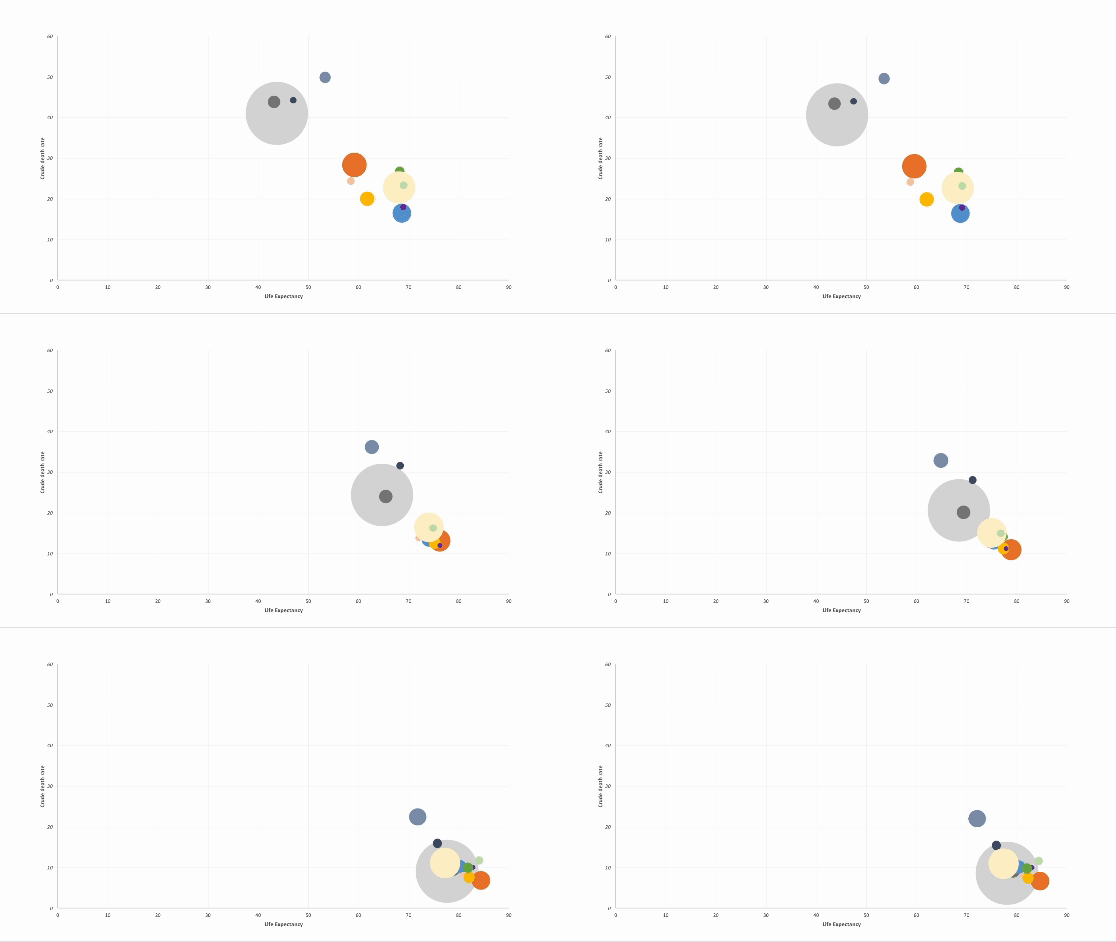
Discover how to elevate your PowerPoint presentations with animated charts. In this step-by-step guide, I walk through a technique for animating scatter plot charts.
How to Animate Pie Charts in PowerPoint
In this article, I share a step-by-step guide of how to animate pie charts in PowerPoint so you can give more engaging data-driven presentations.
Animating Charts in PowerPoint For Better Data-Driven Presentations
In this post, I share tips on how to animate charts in PowerPoint as a means to help you give compelling data-driven presentations to a live audience, be it a lecture hall or a boardroom.
COVID-19 In Charts: Examples of Good & Bad Data Visualization
With the world on lockdown as a result of Covid-19 one thing I’ve noticed over the last few months has been a steep rise in interest for charts and data visualization. And in today’s post I break down some examples of both good and bad dataviz related to Covid-19.
Data Visualization 101: Design with Purpose and Don't Stuff Your Charts
Data visualization is very much an art
How To Lie With Charts
Some of the best examples of data visualization today can be found in journalism. In recent years, many, if not most, global news networks have embraced empirical storytelling and have made significant investments in both the people and technology needed to tell compelling visual stories powered by data.
5 Data Visualization Lessons for Creating Winning Infographics
If you liked my last article on data visualization sins check out my latest guest post on Outbrain. In this article I specifically focus on data visualization for infographics. Below is a snippet, but follow the link to Outbain for more juicy examples and tips for designing better data driven infographics.


