
Animating Charts in PowerPoint For Better Data-Driven Presentations

Late last year, I was invited to speak at a live event where I would present the findings of a survey my company had conducted on travel behaviour across Southeast Asia. Needless to say, the presentation would be data-driven, as it would include a slides presentation primarily made up of charts.
But I faced some challenges. The venue was a large lecture hall, and I would be presenting to an audience of more than 500 attendees. The stage did feature a large high-resolution screen. However, the lecture hall was huge, and some of the attendees were seated quite a distance from the screen. For scale, you can see a pic of me presenting at the event in the header image above
And yes, that's a huge screen! But even with that large screen size, I was concerned that attendees might have trouble making out the charts and information contained within them, such as the axis labels, legend, etc. This would be especially problematic for attendees seated farther back in the lecture hall.
I needed to find a way to present the data in a way that was clear, compelling and accessible to the audience given the venue.
The power of animated data
Many people don't know this, but animations in PowerPoint can be applied to charts, and with some basic configuration, you can use these features to tell amazing stories. And using animations (as well as some smart formatting and transitions) in PowerPoint was just what I needed to make my presentation a success!
I've published a video on my YouTube channel that details the process I went through for animating charts in PowerPoint. You can check it out below or read on for step-by-step instructions.
I want to caveat that the tips in this article (and the video linked above) are designed for giving presentations in a live environment. You wouldn't really want or need to build out these kinds of animations for a presentation that sent out for solo viewing. But if you are planning to give a presentation that includes data presented in charts, whether it's a large lecture hall or a board room at work, then these tips are for you!
Example 1: Multi-series bar charts
In this example, we have a multi-series bar chart that features survey data for top movie genres across seven countries. To start, here's an example of what Excel or PowerPoint would create as a default chart.

Multi-series bar chart
Needless to say, if we were to drop this chart on a slide, it would fall flat during a live presentation. To fix this we're going to use a simple Wipe animation and some basic formatting to make this chart more interesting.
Here are the steps you need to follow.
1. Select the Animations ribbon, and select the Wipe animation

Adding animations to multi-series bar charts - Step 1
2. Click Effect Options. If the option is ghosted, then click Animation Pane, then select the chart from within the animation pane (it will be listed as Chart 1, or something similar)

Adding animations to multi-series bar charts - Step 2
From Effect Options, make sure From Bottom is selected, then choose By Series.

Adding animations to multi-series bar charts - Step 3
You can also change the triggers and timing of the animations via the animation pane if you need more control. But that's it.
Here’s an example of what your animated chart will look like.

Final animation of multi-series bar chart
The steps above cover how to set up the initial wipe animations. But if you’re curious how setup focus transition on the individual bars, check out the video above, time stamp 6:20.
Example 2: Stacked bar charts
Now we will look at a stacked bar chart. In this example, the stacks show the number of TV sets owned by consumers in 7 countries. Here’s what the chart looks like in Excel or PowerPoint by default.
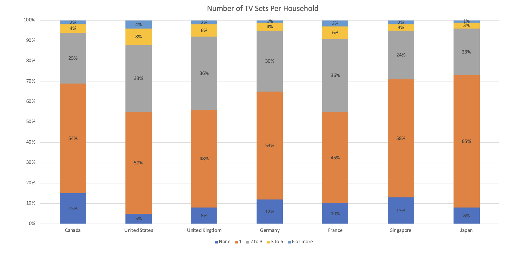
Multi-series bar chart
We're going to apply the same treatment as example 1, where we use a simple Wipe animation to animate the chart. So you can follow the same four steps listed above. Here’s what the final product will look like.

Stack bar chart animation
And jump to timestamp 11:42 in the video for a walkthrough of how to reveal the data over steps using transitions.
Example 3: Time-series (line) charts
Finally, we'll look at a time-series chart. In this example, we have combined data from two different sources, which both feature daily level data. The first dataset is based on survey data which asked the respondents if they thought their country's economy was going to grow, shrink or stay the same in the next 12 months. The second source is Google Trends data, mapped to the same time frame as the survey data, and which shows Google search trends for the term "recession". To summarize, the chart aims to show the correlation between consumers thinking the economy will shrink and actual Google searches for the term recession.
Here's an example of what the chart looks like by default in Excel/PowerPoint without any formatting.

Time series chart
And again, we're going to apply a wipe animation. But this time, we want the animation to start from the left instead of the bottom. Here are the updated instructions:
1. Select the Animations ribbon, and select the Wipe animation

Time series chart animation step 1
2. Click Effect Options, select From Left and By Series.
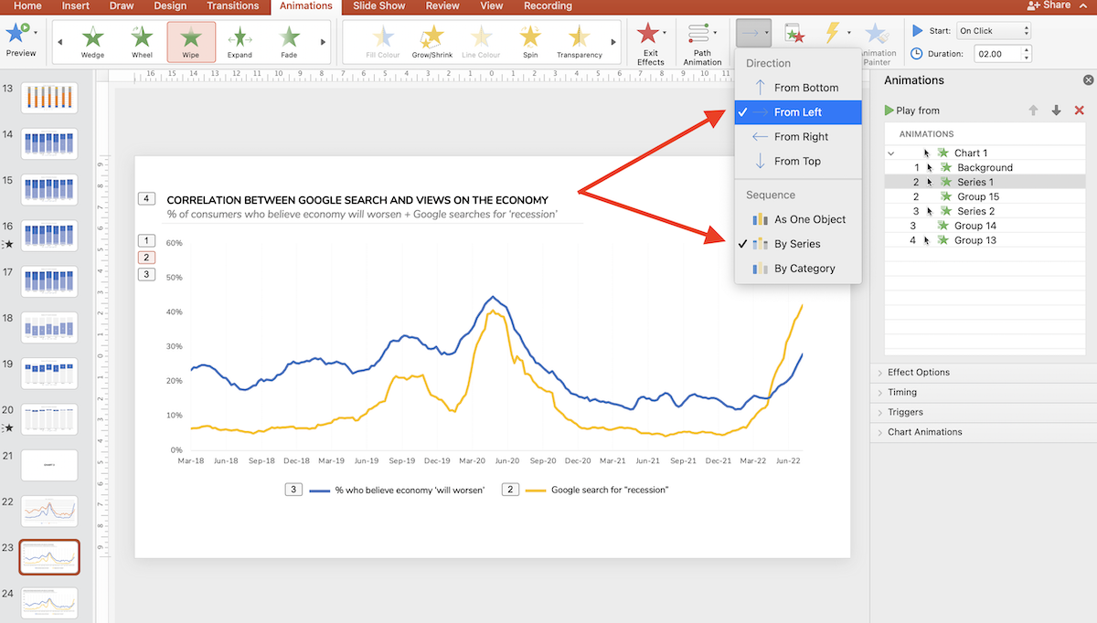
Time series chart animation step 2
And here’s what it looks like when animated.

Time series chart final animation
And if you’d like to see the full list of instructions for formatting this chart skip to 16:10 in the video above.
You can also download the template with all of these animations and transitions built-in using the button below.
That's it for today. I hope these tips are useful and good luck with your next presentation!
