
Blog

10 Chart Formatting Tips to Become a Better Data Storyteller
Most charts contain the right data but tell the wrong story. Here are 10 practical chart formatting tips to help you tell great data stories.
Learn How to Become a Great Data Storyteller: New Course!
Check out our newest course, the ultimate data visualization and storytelling bootcamp.

Data Visualization Toolkit: The 4 Types of DataViz Tools
Feeling overwhelmed by the vast selection of data visualization tools? Learn about the 4 main types of tools and when to use them.
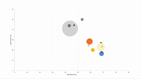
How to Animate Scatter Plot Charts in PowerPoint
Discover how to elevate your PowerPoint presentations with animated charts. In this step-by-step guide, I walk through a technique for animating scatter plot charts.

How to Animate Pie Charts in PowerPoint
In this article, I share a step-by-step guide of how to animate pie charts in PowerPoint so you can give more engaging data-driven presentations.

Animating Charts in PowerPoint For Better Data-Driven Presentations
In this post, I share tips on how to animate charts in PowerPoint as a means to help you give compelling data-driven presentations to a live audience, be it a lecture hall or a boardroom.