
Blog
How to Animate Scatter Plot Charts in PowerPoint
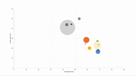
Discover how to elevate your PowerPoint presentations with animated charts. In this step-by-step guide, I walk through a technique for animating scatter plot charts.

How to Animate Pie Charts in PowerPoint
In this article, I share a step-by-step guide of how to animate pie charts in PowerPoint so you can give more engaging data-driven presentations.

COVID-19 In Charts: Examples of Good & Bad Data Visualization
With the world on lockdown as a result of Covid-19 one thing I’ve noticed over the last few months has been a steep rise in interest for charts and data visualization. And in today’s post I break down some examples of both good and bad dataviz related to Covid-19.

How To Lie With Charts
Some of the best examples of data visualization today can be found in journalism. In recent years, many, if not most, global news networks have embraced empirical storytelling and have made significant investments in both the people and technology needed to tell compelling visual stories powered by data.

Should Chart Y-Axis Baselines Always be Zero? Context is Everything
Matt Yglesias and Johnny Harris over at Vox recently posted a great video about a rather contentious issue when it comes to storytelling and data. That is, whether or not you should always set Y-axis baselines in bar or line charts to zero. I’ve written about this a few times in the past and I wanted to take a moment to add a few points to the debate.

Jason Chaffetz's Impossible Chart & Some DataViz Sins You Should Never Commit
So there’s a chart making the rounds in the media right now that was used by U.S. Rep. Jason Chaffetz (R-UT), the chair of the House Oversight Committee, during a senate hearing with Planned Parenthood president Cecile Richards. The chart Chaffetz presented offers some valuable lesson in how data can be visually manipulated to deceive, and how we can all be better communicators with data.