
Blog

How To Build a Personal Brand and Land a Data Job Using Claude Code
The B.R.A.N.D. framework is a system prompt you can run with Claude Code that builds your entire personal brand and job search toolkit from scratch — all generated from a single workflow!

The Data Job Market in 2026: Why It Feels Harder Than Ever (And What To Do About It)
Why data jobs feel harder to land in 2026 and how to stand out, get interviews, and land offers.
Learn How to Become a Great Data Storyteller: New Course!
Check out our newest course, the ultimate data visualization and storytelling bootcamp.

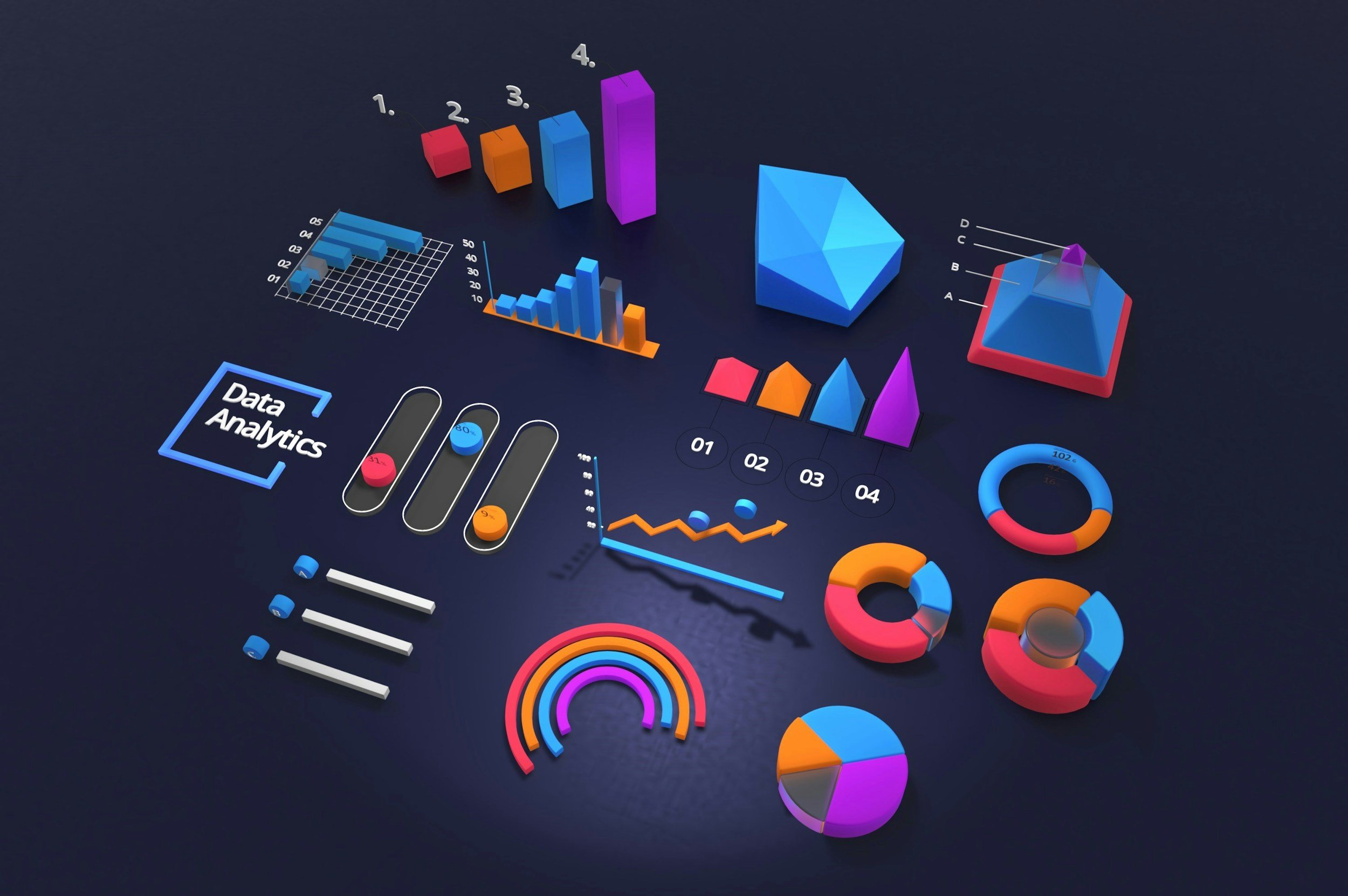
Data Visualization Toolkit: The 4 Types of DataViz Tools
Feeling overwhelmed by the vast selection of data visualization tools? Learn about the 4 main types of tools and when to use them.

How To Automate PowerPoint Slides From Excel Using Python and ChatGPT
Learn to automatically generate hundreds of PowerPoint slides with charts in seconds using Python and ChatGPT.

The State of the MCU in Charts (Updated 2024)
Since MCU’s debut film, Iron Man, in 2008 we’ve averaged 2 Marvel films a year. So I wanted to examine box office performance critical reception to the franchise.

The 2024 Ultimate Guide to Marketing Metrics (eBook)
Download my eBook and get access to a glossary of more than 100 marketing metrics across channels like Facebook, TikTok, Google Ads and more!
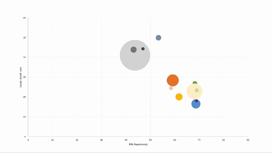
How to Animate Scatter Plot Charts in PowerPoint
Discover how to elevate your PowerPoint presentations with animated charts. In this step-by-step guide, I walk through a technique for animating scatter plot charts.

How To Create Custom Reports in Google Analytics (GA4)
Frustrated with Google Analytics 4? Let me help you. In this article, I provide a step-by-step guide for how to customize the interface and to create custom reports.