
Blog
How to Animate Scatter Plot Charts in PowerPoint
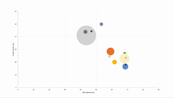
Discover how to elevate your PowerPoint presentations with animated charts. In this step-by-step guide, I walk through a technique for animating scatter plot charts.

How to Animate Pie Charts in PowerPoint
In this article, I share a step-by-step guide of how to animate pie charts in PowerPoint so you can give more engaging data-driven presentations.

The Human Side of Analytics
I'll be giving a talk at the Asian Marketing Effectiveness & Strategy (AMES) 2016 conference next week and I wanted to share a teaser of the presentation I'll be giving. My session is titled The Human Side of Analytics and will explore the role people, communication and storytelling within the big data and analytics industry.

5 Data Visualization Lessons for Creating Winning Infographics
If you liked my last article on data visualization sins check out my latest guest post on Outbrain. In this article I specifically focus on data visualization for infographics. Below is a snippet, but follow the link to Outbain for more juicy examples and tips for designing better data driven infographics.

Communicating Data & The Rise of the Empirical Storyteller
Statistics are often not enough to convince a boardroom full of people to believe in and pursue a particular course of action. Data, no matter how objective it is in reflecting a truth, is only one piece of the puzzle as you need to consider how to effectively communicate what the data means. Storytelling is the key to getting your ideas to resonate and is a focus that hasn't been thoroughly explored yet in the analytics industry.

Jason Chaffetz's Impossible Chart & Some DataViz Sins You Should Never Commit
So there’s a chart making the rounds in the media right now that was used by U.S. Rep. Jason Chaffetz (R-UT), the chair of the House Oversight Committee, during a senate hearing with Planned Parenthood president Cecile Richards. The chart Chaffetz presented offers some valuable lesson in how data can be visually manipulated to deceive, and how we can all be better communicators with data.

Thematic Maps And a Brief History of Geographical Data Visualization
I'm a total sucker for geographical data viz and lately I've found myself losing countless hours exploring CartoDB's growing community gallery of maps. Seriously, if you need some visual inspiration today head on over to their site and marvel at the beautiful intersection of geography, data and creativity.

The Three Types Of People Who Use Data
As someone who works in the private sector, or more specifically, in marketing, I’ve seen data applied in some pretty manipulative ways to make a point or validate an untested hypothesis. if you're working in the field of marketing analytics and you care about being truthful you'll always struggle to find the right balance between time, cost and rigour. But not everyone understands the importance of rigour when it comes to truthful interpretation of data, and worse, some don’t care.