
Blog
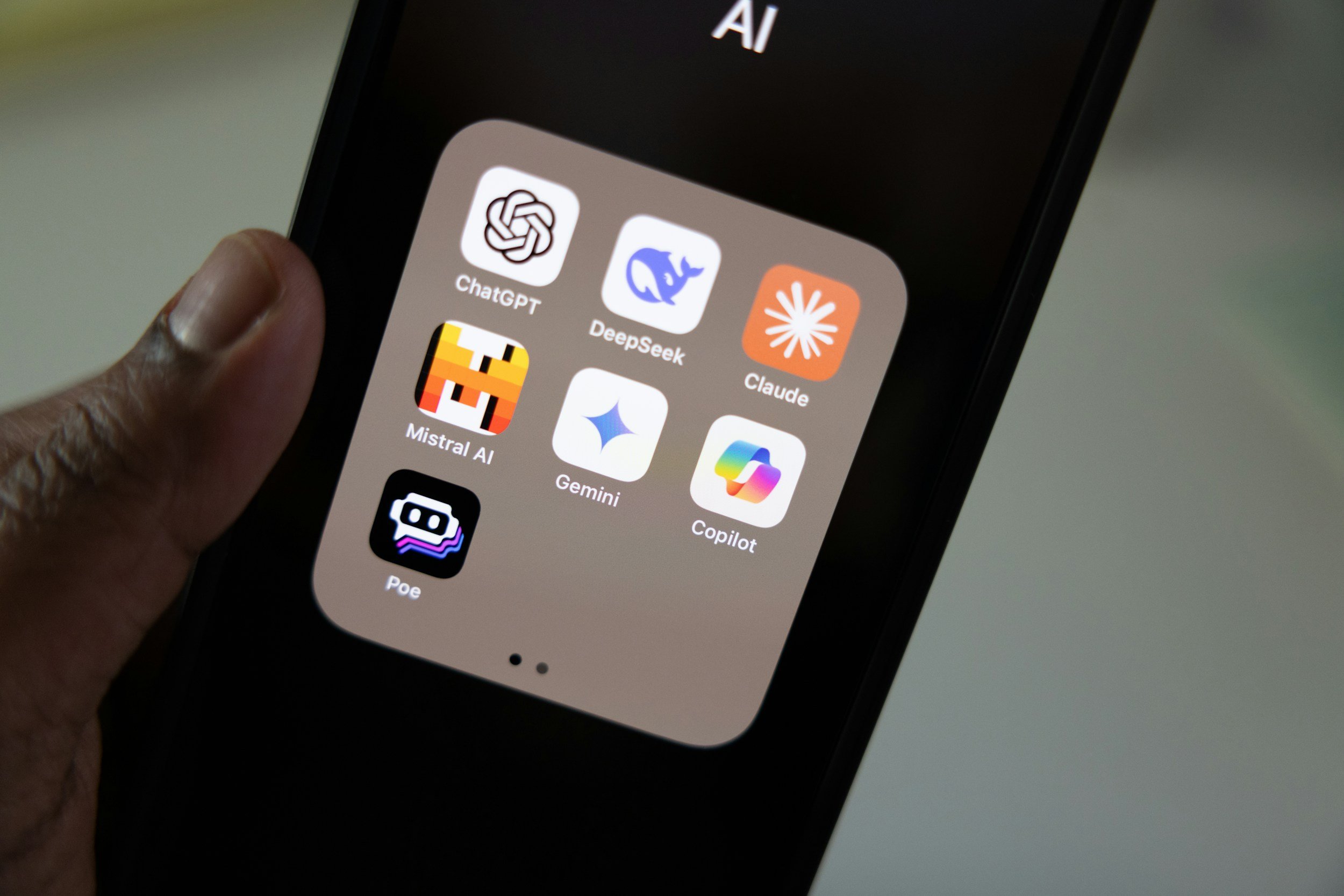
How To Build a Personal Brand and Land a Data Job Using Claude Code
The B.R.A.N.D. framework is a system prompt you can run with Claude Code that builds your entire personal brand and job search toolkit from scratch — all generated from a single workflow!

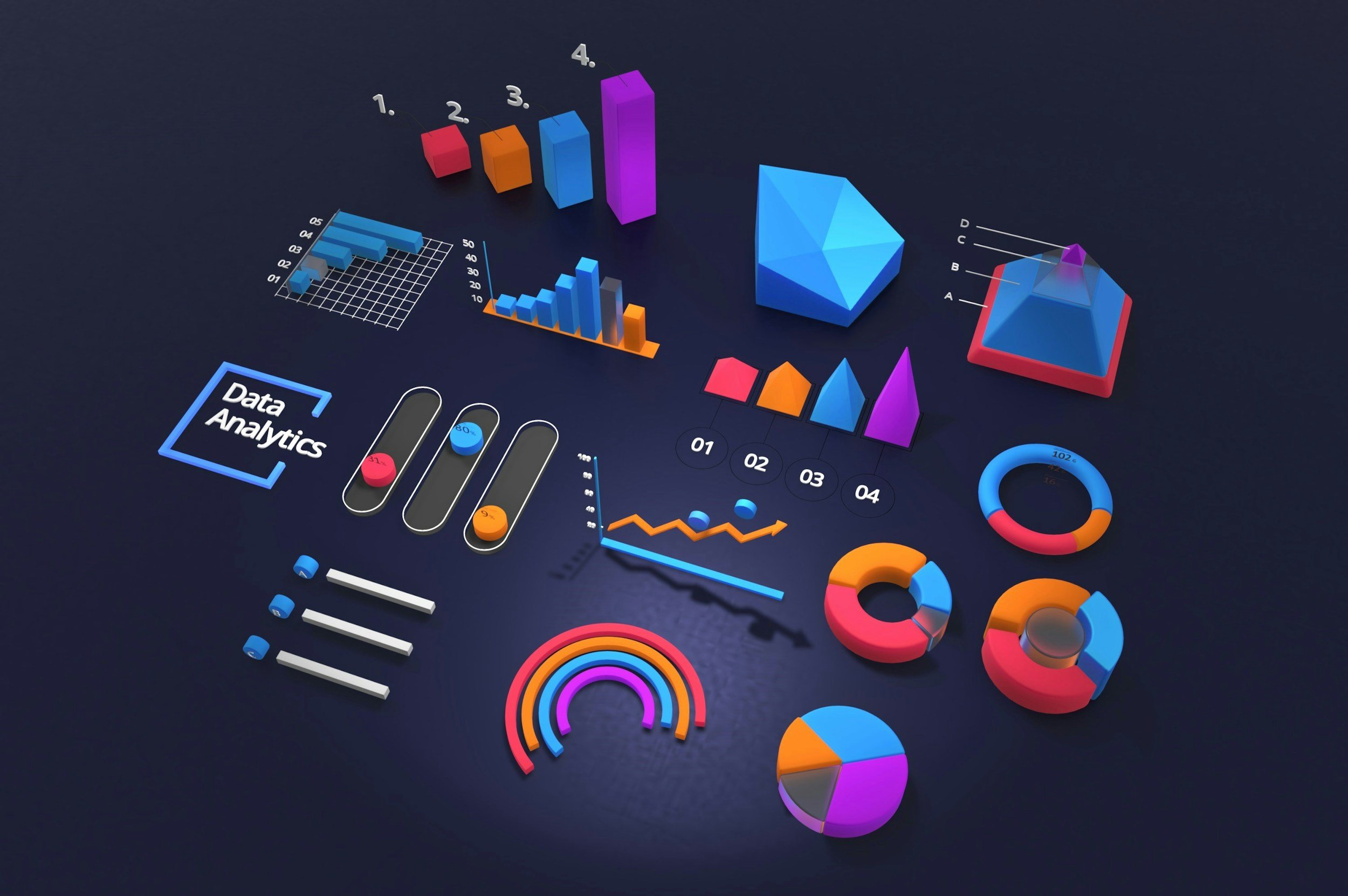
10 Chart Formatting Tips to Become a Better Data Storyteller
Most charts contain the right data but tell the wrong story. Here are 10 practical chart formatting tips to help you tell great data stories.

The Data Job Market in 2026: Why It Feels Harder Than Ever (And What To Do About It)
Why data jobs feel harder to land in 2026 and how to stand out, get interviews, and land offers.
Learn How to Become a Great Data Storyteller: New Course!
Check out our newest course, the ultimate data visualization and storytelling bootcamp.

Data Visualization Toolkit: The 4 Types of DataViz Tools
Feeling overwhelmed by the vast selection of data visualization tools? Learn about the 4 main types of tools and when to use them.

The Benefits and Pitfalls of Using LLM’s for Qualitative Data Analysis (QDA)
GenAI for market research: Learn about the benefits and potential pitfalls of using LLMs in qualitative data analysis (QDA). Practical tips for researchers to improve output.

How To Conduct Ideal Customer Profile (ICP) Research That Actually Drives Results
Learn how to conduct ideal customer profile (ICP) research using secondary and primary methods.

7 Types of Survey Bias & How to Prevent Them
Learn about common survey biases like sampling, response, and non-response bias. Learn how to minimize bias and ensure representative results.

Guide to Understanding Beginner, Intermediate & Advanced Excel Skills?
What’s the difference between a beginner and advanced user of Excel? And what Excel skills should you be looking to acquire in order to level up? In this article I’ll break down common Excel skills by competency level.