
Blog

Rethinking Measurement: A Call for Meaningful Dialogue in Analytics
Over the weekend a friend and former colleague of mine tagged me in a LinkedIn post titled 5 bullshit metrics you need to stop using to measure content marketing success. In it, the author details 5 digital metrics he thinks content marketing folks need to chuck out the window. Here's my response.
Data Visualization 101: Design with Purpose and Don't Stuff Your Charts
Data visualization is very much an art

How To Lie With Charts
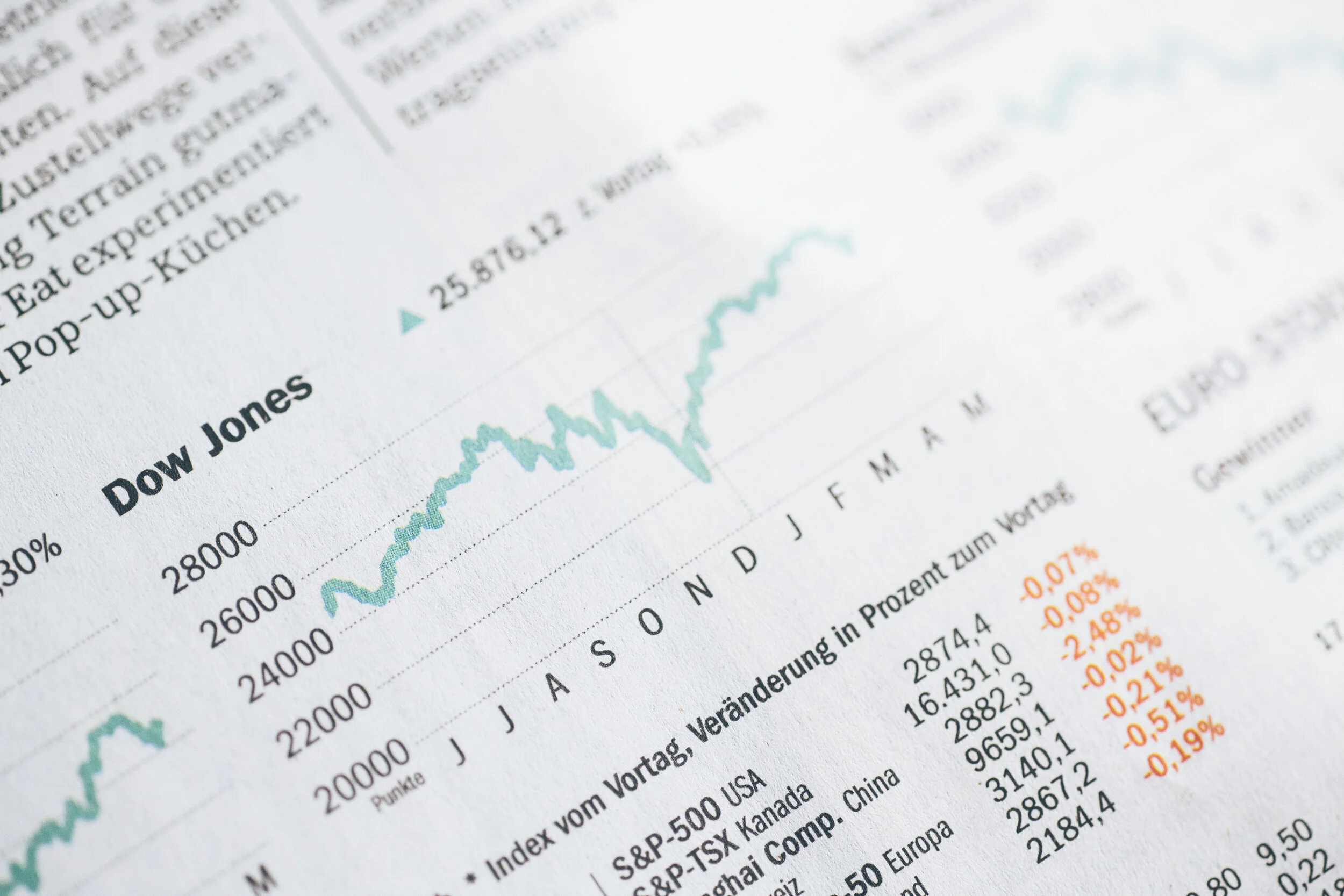
Some of the best examples of data visualization today can be found in journalism. In recent years, many, if not most, global news networks have embraced empirical storytelling and have made significant investments in both the people and technology needed to tell compelling visual stories powered by data.

Here's a Full Rundown of My Talk at AMES 2016
Last week I gave a short talk at AMES 2016. I’ve had a few requests to share the full presentation deck, but I’ve realized that some of the slides may not make a ton of sense without the talking points. So here’s a full run down of the presentation and what I covered.

The Human Side of Analytics
I'll be giving a talk at the Asian Marketing Effectiveness & Strategy (AMES) 2016 conference next week and I wanted to share a teaser of the presentation I'll be giving. My session is titled The Human Side of Analytics and will explore the role people, communication and storytelling within the big data and analytics industry.

Your Web Analytics Data is Lying to You, so Fix it Already
We rely on data analytics software and tools to answer key business questions. But sometimes, those tools can lie. In this post I like at examples of how some reports in Google Analytics can be misleading.

5 Data Visualization Lessons for Creating Winning Infographics
If you liked my last article on data visualization sins check out my latest guest post on Outbrain. In this article I specifically focus on data visualization for infographics. Below is a snippet, but follow the link to Outbain for more juicy examples and tips for designing better data driven infographics.

My Talk on Data Visualization
Last Friday I had the chance to give a short talk on data visualization at an event co-hosted by General Assembly and Keboola. Despite a wicked storm (thanks to Singapore's late blooming rainy season) and a late night Friday event we had a great turnout, and with a really fun crowd I might add. Some great questions and discussion all around.

5 Examples of Awful Data Visualization
From the deceptive to the confusing to the downright ugly graphics created in the name of statistics, sometimes it’s the lessons you learn from failure that are the most impactful. In this post, I look at some examples of bad dataviz, and how to fix them.