
My Talk on Data Visualization
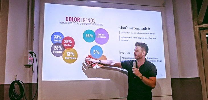
Photo Credit: Pavel Bulowski
Last Friday, I had the chance to give a short talk on data visualization at an event co-hosted by General Assembly and Keboola. Despite a wicked storm (thanks to Singapore's late blooming rainy season) and a late night Friday event we had a great turnout, and with a really fun crowd I might add. Some great questions and discussion all around.
I just wanted to share the slides I presented during the event, which you can see below. I've actually written about a lot of the content included within in the presentation before, So if you want a more in depth reading on any of the content, check out these posts:
And here are a few pics from the evening.
Featured
