
Data Visualization 101: Design with Purpose and Don't Stuff Your Charts
Data visualization is very much an art form, and one that requires the artist to make good design choices based on what kind of data they have, how it’s structured, and what they’re trying to say.
I come across examples of bad dataviz every day. Some are bad because of the creator's intent, while others are bad for more innocuous reasons, such as the creator not adhering to basic formatting rules, not choosing the right chart, or simply trying to pack too much into one graphic.
I recently came across a report that featured a chart which falls into the latter category. That is, the creator had good intentions but made a few bad design choices along the way. I wanted to share this chart with you and offer a few thoughts about what went wrong and how it could have been presented more effectively.
Unfortunately, I can’t upload the original graphic here as it was featured in a paid report, and redistribution is protected under copyright. I have, however, reconstructed the chart and redacted some elements of the dataset. This should give you the gist of what the chart was trying to say without redistributing parts of the report and the underlying dataset.
If you’re interested, you can access the report here, but you’ll need to pay to view the full publication, including the chart I’m calling out. It is worth noting that, despite this poorly designed chart, it’s an interesting report that offers a good read on how data analytics is being applied/perceived across various industries. So go give it a look. There’s also a free sample of the report available where you can view the key findings and takeaways.
Alright, onwards.
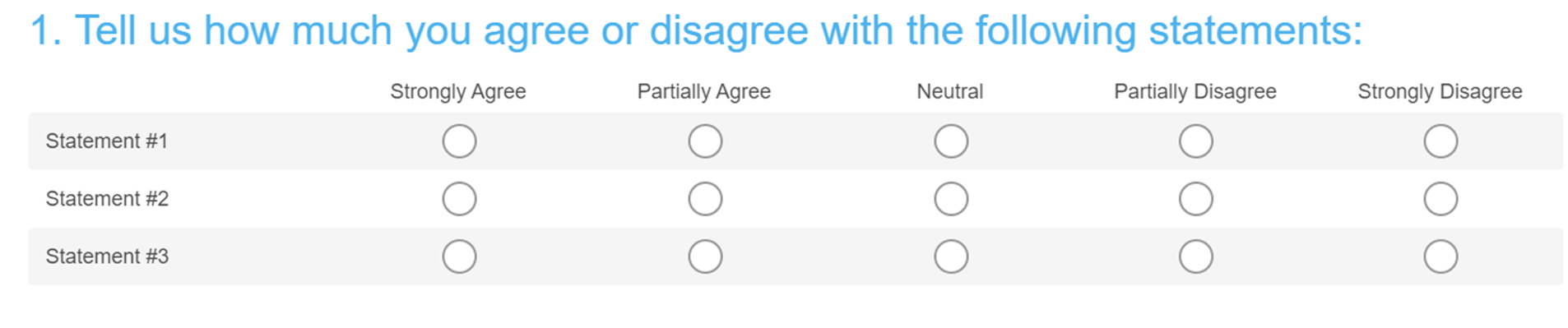
Before I present the chart, it’s important that you understand the structure of the underlying dataset. This chart was created based on a survey completed by an expert group (e.g. C-suites). The survey presented the respondents with 3 statements they were asked to rate using a Likert scale (i.e. Strongly Agree, Partially Agree, Neutral, Partially Disagree, Strongly Disagree). If you saw this question in a survey, it might look something like this:
The report also presents this data across two time intervals, in this case 2015 and 2016. This simply means that the authors' ran the same survey with the exact same question set across two different years as a means to show how the data trends over time.
Below is my recreation of the chart. Again, I’ve redacted certain pieces of information so as to not reveal actual findings in the report.
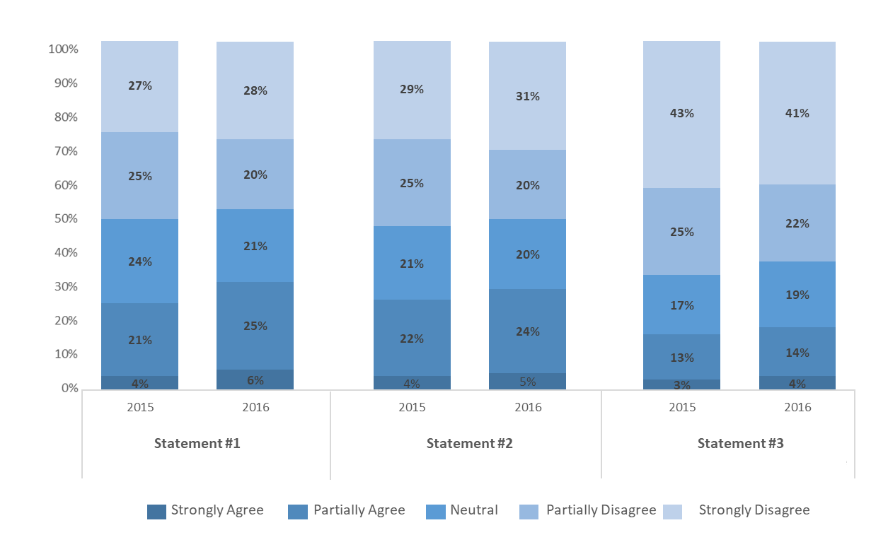
So, what’s wrong with this chart? Technically, there’s nothing fundamentally wrong or deceiving about it. It is, however, packed with data, making it confusing and hard to interpret. The crux of the issue here is that the creator attempted to include too many variables and dimensions within a traditional chart type (i.e. 100% stacked bar chart), which isn’t well equipped to handle this much data. I’ve written about the challenges of visualizing more than two variables before, and cracking this usually involves more creative approaches to thinking about visualization. The graphic below is a great example of how one could visualize many variables within a single chart. This is Charles Joseph Minard’s thematic map about Napoleon’s failed Russian campaign (which plots six different data points on a single graphic!).
So what exactly is wrong with the stacked bar chart shown earlier? Here are a few things that stood out to me.
Too many variables and dimensions in a single graphic
As I mentioned above, this chart is packed with data. In particular, the author was attempting to visualize three variables (i.e. statements) across five sub-variables (i.e. strongly agree, partially agree, etc) and one dimension (i.e. binary time interval). That’s a lot to say in one chart. We’ll unpack this a little more in the following two points. But suffice it to say, the sheer amount of data they’re trying to present here is not easily visualized using a single traditional chart.
Difficult to compare across time intervals
There are many different ways you could present this data, but the most effective way would depend on the creator's original purpose or objective. In this case, I’m reasonably sure the goal was to highlight the differences between the time intervals (e.g. change in agree vs. disagree between 2015 and 2016). This is an important point because if the objective was less about the change-over-time and more about, say, the differences between the statements in one of the time intervals, you’d likely opt for a different approach to presenting the data.
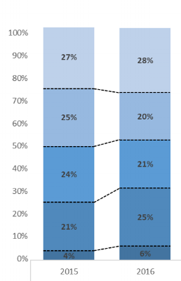
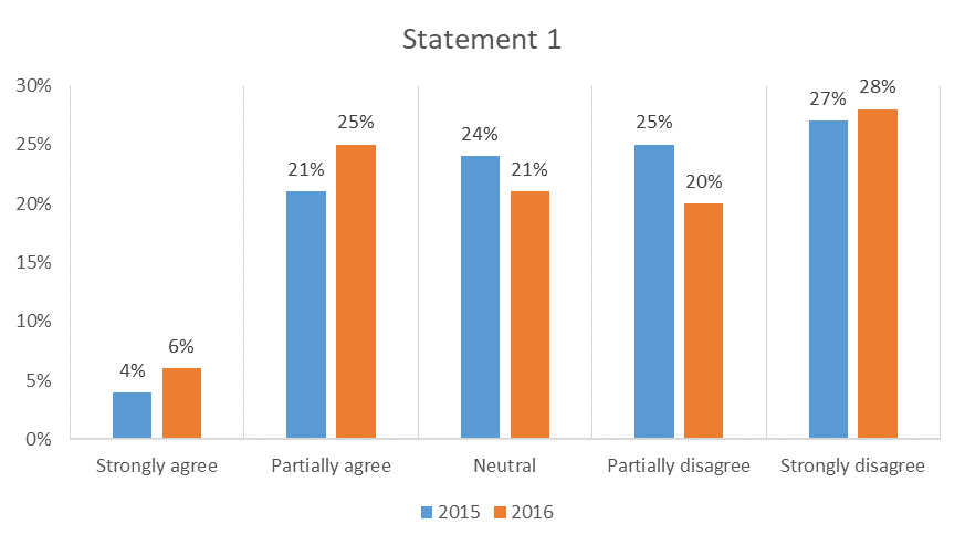
Given the objective mentioned above, my main gripe with this chart is that it makes it unnecessarily burdensome to compare across the two years of data. This is because with a 100% stacked bar chart, you don’t have even baselines across the response categories to easily compare year one vs year two. The graphic below illustrates what I'm talking about.
Sure, you still have the data labels on the chart to compare the % values, but you could have just as easily presented this data in a table, and it would have been a lot easier to read. The fact that the creator chose to visualize the data this way suggests s/he wanted to find an easier way for their readers to see the change-over-time in a visually appealing way. Good intentions, poor execution.
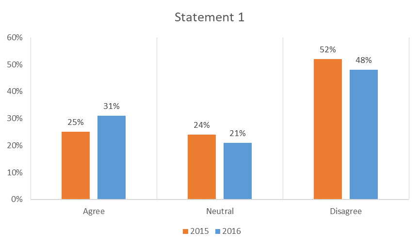
I do think this approach would have been fine if the creator wasn't attempting to show how the data trended, and instead focused on comparing the research outcomes across the 3 statements. Below is an example of this, which is basically the same chart but only showing 1 time interval (i.e. 2016).
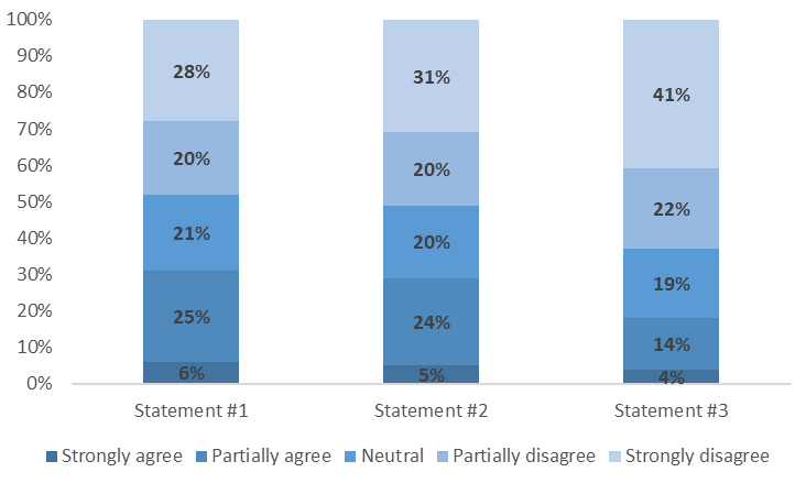
With this example, the reader can still compare the % breakdown across the 3 statements, but they aren’t forced to try and compare the change-over-time for any one statement. That’s a significant difference, as the approach shown above doesn’t require the reader to line up the % mentally breaks across categories to see the delta year on year.
Percentages of percentages
Last but not least, where I found this chart particularly difficult to read was the relationship between the y-axis scale and the percentage breaks across the response options (i.e. strongly agree, etc). The reader is presented with a 100% scale, but you also need to interpret the response category breaks across the 3 statements for two time intervals. Again, there’s nothing fundamentally wrong with the data. But it’s hard to read and harder still to compare over time. As the reader, you’re being asked to read, process and interpret a lot of different things all at once.
So how can it be improved?
Before I get to showcase a few different ways to present this data, I want to take a moment to talk about why this is important. You might look at the original chart in question and say, "hey, it's not perfect but I can still read it. So is there anything wrong here?"
My response is… absolutely! The purpose of visualizing data is to make raw data easier to process and interpret. Therefore, one goal you should always reach for when visualizing data is speed. That is, the speed at which your audience can draw a meaningful conclusion. If your audience needs to spend five minutes just trying to understand the chart before moving on to interpreting what it says, then you’re not using visualization effectively. There are exceptions, of course, as some dataviz is less about informing the audience and more about sparking curiosity, or creating beauty from chaos.
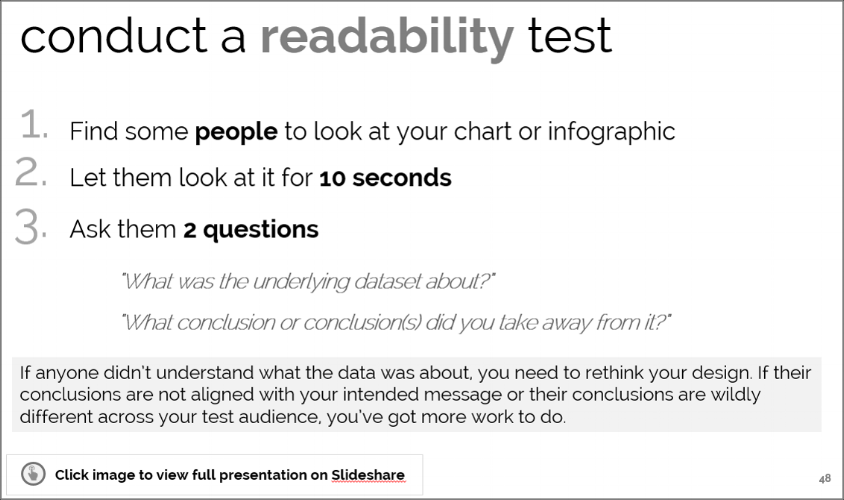
In the past, I've talked about using a readability test to QC a chart you've created. You can read more about it in the slide below. The point is your objective should be to create charts that make it easier and faster for the reader to understand the data and start drawing conclusions.
Now back to the chart in question. I have a few ideas about how this data could have been presented more effectively - one easy way that relies on more traditional approaches to creating charts, and another that involves a little more custom visualization.
The easy way
I’m taking some liberties here with the creator's original objective, but assuming the focus was indeed to compare the change over time, my suggestion would be to break this into three separate charts instead of trying to cram it into one. That might sound like a cop-out, but believe me, it's not. Each of the three statements in the original survey represents fundamentally different questions that the respondents had to answer, and they deserve to be analyzed individually rather than all at once.
With this approach, I used a standard (non-stacked) bar chart with the response options plotted on the x-axis, and the time intervals as the data series. Again, my objective here is to focus on the changes over time, so I'm keeping the time dimension but splitting each of the variables into a separate chart. I've only presented one of the three charts below, but you get where I'm going with this.
By not using the stacked chart here you have an even baseline to compare the change-over-time, and for each response category. And by separating the statements into three separate charts the reader can take their time to interpret the results in the context of each question that was asked.
Another treatment you could apply is to combine the positive and negative response categories (i.e. combining Strongly Agree + Partially Agree, and Strongly Disagree + Partially Disagree). You need to tread lightly when combining categories with closed-ended survey data, as this can sometimes lead to misinterpretation. So always consider the question text, question type and how this could impact the audience’s interpretation before you do this. Also, declare that you’ve re-coded or combined response categories somewhere on your chart. In the case of the chart in question, the report author tended to combine categories in their written analysis anyway by reporting on the total % change for net agree and disagree. So, it seems reasonable that you could apply this thinking to the chart as well. Here’s what that would look like:
All this does is reduce cognitive load by presenting the reader with three response categories instead of five. It might not work or even be appropriate for every case. But for this dataset, I do find that fewer categories make for an easier read of the data. I also think this approach more clearly illustrates the analysis that accompanied the original chart - that more respondents (i.e. c-suites) shifted to agree with the statement in 2016 over 2015.
The not-so-easy way
As I mentioned earlier, when you’re working with multi-variate charts, sometimes the standard charting options available to you in programs like Excel aren’t always up to the task. For these cases, more creative and bespoke approaches are needed. We’re now venturing into custom data visualization, but I’ve mocked up one approach that doesn’t veer too far from the traditional charts we're generally exposed to.
First, a few caveats. I’ve designed this chart under the assumption that a) the objective was to highlight the change over time, and b) I wanted to present all three variables (i.e. statements) on a single graphic. To simplify the chart, I’ve combined the agree and disagree categories and removed the neutrals entirely to have even baselines.
Here’s what it looks like.
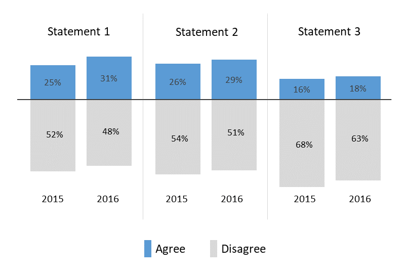
This is basically a stacked bar chart, with the disagree columns plotted as negative values. The dark grey line that cuts through the centre serves as the zero baseline for both the agree series (in blue) and the disagree series (in light grey).
Needless to say, this chart requires a lot of caveats when being presented, such as noting that the neutral responses have been removed for the sake of readability. It’s not perfect, but is certainly one approach that gets us closer to creating a complex, multi-variate chart that’s easier to read.
So what should you take away from this?
A few things. First, always make sure you consider the objective of your chart or visualization. You can have the exact same dataset and choose to visualize it in many different ways, and it won’t necessarily be wrong, or bad. Your objective(s) will inform everything from the chart type to even more subtle design choices related to formatting. So make sure you know what you’re trying to say, and design with that in mind. Put simply, design with purpose.
That said, never let your intention drive you to remove context or deceive your audience. Jason Chaffetz’s now infamous Planned Parenthood chart is an excellent example of where a chart creator’s bias (and generally poor handle of basic chart formatting rules) can lead to designing charts that straight-up lie.
In the end, you could say that effective data visualization sits at the intersection of a clear objective, great design and good intentions.
