
10 Chart Formatting Tips to Become a Better Data Storyteller

You've pulled the data, run the numbers, and built the chart. Job done, right?
Not quite. Because here's the thing: a chart that contains the right data and communicates the right message are two very different things. And for most working professionals, the gap between those two things is where the story gets lost.
The good news is you don't need to be a designer or a data scientist to fix it. Most of what separates a confusing chart from a clear one comes down to a handful of practical formatting decisions. In this article, I'll walk you through ten of them.
1. Start With Purpose, Not a Chart
Before you open Excel, Tableau, Metabase or any other tool, ask yourself: What is this chart for? What do I want my audience to understand or do after seeing it?
This sounds obvious. But it's surprisingly easy to skip. You have a dataset, you highlight the columns, you click Insert Chart, and you start tweaking from whatever default the tool gives you. That's designing without purpose, and it usually shows.
Purpose-first thinking changes everything, the chart type you choose, the level of detail you include, even how much context you add. A chart designed for a live boardroom presentation has different requirements to one embedded in a self-serve dashboard. A chart intended to highlight a single trend needs a different approach to one meant for exploratory analysis.
💡 Before you build anything, ask: What's the one thing I want my audience to take away from this? If you can't answer that in a single sentence, you're not ready to chart your data.
2. Reduce the Clutter
This is one of the most impactful changes you can make to almost any chart, and it costs nothing except a few minutes.
The concept of data ink, popularised by statistician Edward Tufte, holds that every element of a chart uses up "ink," and that ink should be either earning its place by communicating data or eliminated. Drop shadows, 3D effects, heavy gridlines, thick borders, redundant legends, garish default colour palettes — none of these help your audience understand the data. They just add noise.
Cole Nussbaumer Knaflic, whose book Storytelling with Data offers a great decluttering checklist:
Remove chart borders
Reduce or remove gridlines
Clean up your axes
Use consistent colours
Eliminate anything that doesn't directly support the message of the chart
💡 A practical way to approach this: once you've built a chart, go through it element by element and ask, "If I removed this, would the chart be harder to understand?" If the answer is no, remove it.
3. Write Titles That Tell the Story
Most chart titles I see in the wild look something like this: "Monthly Revenue by Region."
That's a label, not a title. It describes what is in the chart without telling the reader what it means.
A better approach is to write an action-oriented title, one that captures the key insight or story. Instead of "Monthly Revenue by Region," try "North Region Outpaces All Others for the Third Consecutive Quarter." The reader knows immediately where to look and what the chart is saying.
You can also use a subtitle to add context that the chart itself can't easily communicate, such as the time period, the data source, or a caveat that's important for interpretation. Think of your title and subtitle as a two-sentence story: the headline and the supporting detail. Done well, a reader should be able to understand the point of your chart from the title alone, before they've even processed the data.
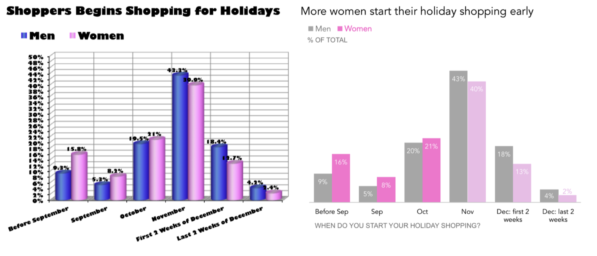
4. Use Colour with Intention
Default chart colour palettes in tools like Excel usually working against you. When everything is colourful, nothing stands out. The eye doesn't know where to go.
One of the most effective techniques in data storytelling is to use grey as your base and colour sparingly to create focal points. Grey out the data series that aren't your main message, and use a single strong colour to highlight what matters. This is especially powerful in bar charts and multi-series line charts, where the contrast immediately draws the audience to the point you're making.
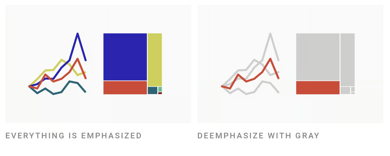
This doesn't mean every chart needs to be grey and one colour. Colour palettes have their place — particularly in charts where the distinctions between multiple categories all matter equally. But when you have a clear message to communicate, selective use of colour is one of the clearest ways to signal to your audience: this is what I want you to focus on.
When choosing colours, lean towards pastels or muted tones with high contrast between them, rather than vibrant primaries that can feel harsh. And when in doubt, fewer colours is almost always better than more.
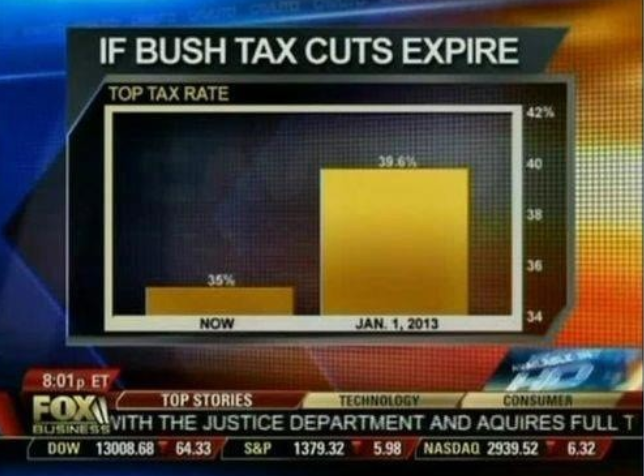
5. Think Carefully About Your Baseline
The question of whether a chart's y-axis should always start at zero has generated more debate in data visualisation circles than almost any other topic.
The concern behind the "always zero" rule is legitimate. A chart with a manipulated baseline can make a small difference look enormous, which can mislead your audience, whether intentionally or not. The Fox News example shown below of a tax rate chart with a baseline starting at 34 (rather than 0) is a famous illustration of this: the gap between two bars looked dramatic, but was actually quite small once shown to scale.
However, always defaulting to a zero baseline can make some charts unreadable. If you're charting a metric that fluctuates between 74% and 82%, starting the y-axis at zero will flatten that variation into an almost horizontal line, stripping away the very context that makes the data meaningful.
A reasonable rule of thumb: bar charts generally benefit from a zero baseline, because bar height is used to communicate magnitude. Line charts have more flexibility, because they're tracking direction and change over time rather than absolute values. But even then, if you truncate the axis, say so clearly in a subtitle, an axis label, or an annotation.
💡 The key principle is transparency: don't adjust the baseline in a way that strips context from the data or misleads your audience.
6. Don't Stuff Your Charts
There's no magic number of categories that makes a chart too cluttered, but you'll know it when you see it. A pie chart with 50 slices isn't a pie chart, it's a colour wheel. A bar chart with 30 categories on the x-axis is almost impossible to read. At some point, you stop being able to decode what you're looking at.
The practical solution is usually to consolidate. Group smaller categories into an "Other" bucket. Show the top eight or ten entries and note that the rest have been excluded. Focus on the segments that are actually relevant to your point.
I've seen guidance saying you should never have more than five slices in a pie chart, or never more than eight bars in a bar chart. I don't think those hard limits are always right. A bar chart with twelve clearly labelled, logically ordered categories can be perfectly readable. A pie chart with seven slices might still communicate proportions clearly. Use judgement and, where possible, ask for feedback from the people who'll actually be reading your charts.
The goal, as always, is to reduce cognitive load — to make it as easy as possible for your audience to extract the information they need.
7. Use Data Labels Thoughtfully
Data labels (the numbers shown directly on chart elements) are useful when used sparingly, and distracting when overused.
On a bar chart with four or five categories, direct data labels are usually a great addition. They mean the reader doesn't have to scan back to the axis to get the exact value. On a line chart tracking 52 weekly data points, labelling every single point creates visual noise that makes the overall trend harder to see.
The best approach is to label what matters and leave the rest to the gridlines. If there's a specific value you want your audience to notice, such as a peak, an outlier, a target, then label that one and leave the others. If your chart has a clear story, the data labels should reinforce it, not compete with it.
💡 A great tip: keep data label formatting clean and consistent. Rounded numbers, a consistent decimal place, and unit labels (%, £, K) applied uniformly make a chart feel much more polished than a messy mix of formats.
8. Add Annotations to Explain What Happened
Charts show what the data did. Annotations explain why.
An annotation is one of the most underused tools in data storytelling. They're particularly valuable in time series charts, where a sudden spike or dip often has a specific cause that the chart itself can't communicate: a product launch, a system outage, a policy change, a competitor's move.
Without an annotation, your reader is left guessing why something happened, which is both frustrating and risky. With a well-placed annotation (e.g. "Competitor X launched in March" or "Pricing change effective Q3" ) the chart becomes a complete story rather than a set of numbers that raises more questions than it answers.
Most BI tools and presentation software support basic annotations. Tools like Flourish and Datawrapper make them especially easy to format nicely. And even a simple text box or callout in PowerPoint or Google Slides can do the job effectively.
9. Create Clear Visual Focal Points
When you show someone a chart with multiple series, multiple colours, and no visual hierarchy, their eye has nowhere to go. They'll start decoding everything at once — trying to figure out what's interesting, what matters, and what you're trying to say. That's hard work, and not every audience will put in the effort.
Your job as the chart's author is to guide the audience to the point, not leave them to find it themselves.
There are a few effective ways to do this. Colour contrast, as discussed in tip four, is one of the most powerful. You can also use size or weight: making the key data series slightly thicker or bolder draws the eye. Positioning the annotation or callout near the focal point reinforces it.
Before - No focus
After - With Focus
This technique is especially effective in presentation contexts (e.g. PowerPoint, Google Slides, Flourish, Datawrapper) where you have full control over the visual layout. In a traditional BI tool / dashboard, you may have less flexibility, but even small formatting decisions (ordering bars from highest to lowest, leading with the most important chart, using a KPI tile to call out a headline number) can go a long way.
💡 Pro-Tip: If you're not sure whether your focal point is clear, ask someone unfamiliar with the data to look at the chart for five seconds and tell you what they noticed first. What they say will tell you everything you need to know.
10. Respect Your Audience's Cognitive Load
This one is less a single tip and more an overarching principle that ties all of the above together: every formatting decision you make should be asked through the lens of does this make the chart easier or harder for my audience to understand?
Nathan Yau of FlowingData, one of the best data visualisation resources on the web, puts it well: when we build charts, we are encoding information that our audience must then decode. A poorly formatted chart increases that decoding effort — and most audiences won't bother once the effort exceeds a certain threshold. They'll nod politely, close the dashboard, and ignore the data entirely.
This means: don't make your audience do work that you can do for them. Label the axes. Write a clear title. Use colour to signal what matters. Keep it simple. Each of those choices is a small act of respect for the person on the other side of the chart.
It also means being willing to get feedback and iterate. If people consistently misinterpret one of your charts, that's not a sign that your audience doesn't understand data — it's a sign that the chart needs another look.
Putting It All Together
None of these tips require a design degree or an advanced analytics toolkit. Most of them can be applied in Excel, Google Sheets, Tableau, Metabase, or whatever tool you're already using. And none of them require you to follow rigid rules that don't fit your context.
The underlying principle behind all ten is simple: great charts communicate clearly, and clear communication requires intention. Know your audience. Know your message. Strip away everything that doesn't serve it. And then make sure your audience knows exactly where to look.
If you're still figuring out which tools to use to bring your data visualisations to life, my guide on the four types of dataviz tools covers the landscape from spreadsheets and BI platforms to presentation tools and open source libraries — and helps you choose the right one for the job.
And if you want to go deeper on this topic, be sure to check out the course I co-created with data scientist Lisa Shiller — The Complete Data Visualization & Storytelling Bootcamp.
