
How to Change Chart Granularity in Google Analytics 4 (GA4)
Google Analytics 4 introduced significant changes to its user interface, a shift from what many had grown familiar with in Universal Analytics (UA). And one of the features I get asked about a lot is how to change the granularity of time-series charts.
You may have noticed that, while viewing data in the Reports section of GA4 there are no chart controls that allow you to change the granularity of time (e.g. hourly, daily weekly, monthly, etc), which was a staple of the UA interface (see example below).
Universal Analytics data granularity toggle
Not only is this important control not present in GA4, there is some downright confusing chart behaviour when you adjust the time range of charts. For example, if I select one of the preset time ranges from the time picker that is more than 30 days (i.e. the “Last 12 months” option), then the chart will apply weekly granularity. But if I configure the time range to the last 12 months by manually choosing the start and end date, the chart will show daily granularity.
GA4 chart granularity: Preset vs manual time picker
This is downright bizarre chart behaviour, and it can create a lot of friction for a data analyst who wants more control.
But the good news is that the toggle that allows you to change chart granularity isn’t completely gone; it’s just sort of hidden. And in this post, I will show you how to find it.
If you’d rather watch a video of this tutorial, you can check out the video below. Otherwise, read on.
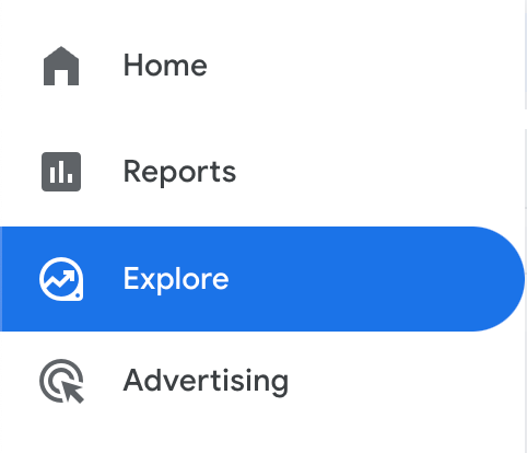
First things first. GA4 has a completely different interface than UA, and if you’re still unfamiliar with it, you need to understand two main sections of the tool: Reports and Explore.
What are Reports?

The reports section of GA4 allows you to view pre-defined reports. When you first open the tool after a fresh install, you will see a number of off-the-shelf reports that come with every GA4 default setup. These are organized under a collection called Life cycle, and include reports related to acquisition, engagement, monetisation, and retention. Many people don’t realize that these reports can be fully customized, or you can build your own report collections with fully tailored reports. I have another article (and video) about customizing GA4 reports, which you can check out here.
But in general, you can think about reports as mostly static dashboards. They allow you to quickly see performance across your core KPIs, and you don’t really need to change or alter these reports after you’ve initially set them up.
The problem is that none of the charts available in the reports section allow you to change chart granularity. This might change in the future (I’m hoping it will). But at the time of writing, this feature isn’t available… in reports.
It is, however, available in the explore section.
What is Explore (aka explorations)?
Explore is a custom report builder in GA4 that facilitates data discovery. From a user interface (UI) perspective, this tool has a lot in common with a UI you might encounter in a business intelligence (BI) or data discovery tool. So, for the seasoned data analysts out there, GA4 Explore (or explorations) will be familiar territory.
However, explorations can be a little intimidating for the average marketer who may be less data-savvy.
So, I’m going to show you how to create time-series charts in GA4 that allow you to change the granularity while also giving you a crash course in explorations.
Ok, let’s go!
Getting started with GA4 explorations
From the left side menu, click on Explore. Then, on the next screen, click Blank to create a new exploration.
Step 1 - Create blank exploration
Next you’ll need to import the metric (or metrics) that you want to see on your chart. You’ll first import metrics (or dimenions) under the Variables column, and once they’re imported you can then add them to your chart or table under the Settings column. Let’s start by importing the sessions metric. Do this by clicking the + sign next the METRICS.
Step 2 - Add metrics
From this screen, you can either use the search bar at the top to find the metric (or metrics) you wish to import, or you can click on the metric sections (i.e. Page / screen, Predictive, Publisher, etc.) to open up the accordion menu and locate the metrics manually. Check the box for the metrics you want (in this case, sessions) then click Import in the top right corner.
Step 3 - Import metrics
Now that you’ve imported the sessions metric, let’s look at the Settings column. The first thing we’ll do is change the VISUALISATION type from table to line chart.
Step 4 - Change visualisation to line chart
Now scroll down within the Settings column and select the sessions under the VALUES option. Optionally, you can also switch off the ANOMALY DETECTION switch below.
Step 5 - Add metrics under VALUES
Now we have a time series chart with some data, but it’s defaulted to daily granularity. We can adjust this by scrolling to the GRANULARITY option, and you can now choose between hour, day, week.
Unfortunately, although monthly is listed in the dropdown, it can not be selected at this time. I’m not sure why this is, but it seems other people have voiced concerns about this on Google community forum. In fact, as of the time of writing, Google's own documentation seems to contradict the latest functionality, as this support page currently states “You can currently view only daily data, not weekly or monthly data”. This is wrong because we can indeed view weekly data in both GA4 reports and explorations. I’m assuming they’ll eventually add support for monthly granularity. But, for now you can only toggle by hourly, daily and weekly.
Step 6 - Change granularity
So that’s it! You’ve made your first data exploration in GA4 and created a chart that allows you to change the granularity, woohoo!
There is, of course, a lot more you can do here. Let’s say you want to add some data series (e.g. breakdowns) to your chart. In particular, say I want to show different lines in the chart for different countries. To do this, we simply need to add a dimension. Start by looking under the Variables column, then click the + icon next to dimensions. Now, find the dimension you want to include in your chart (e.g. country) and click import.
Once imported, go to the Settings column once again, scroll down the BREAKDOWNS, and add the country dimension.
Step 7 (optional) - Add dimensions
If your chart looks messy due to too many lines, you can control this by adjusting the LINES PER DIMENSION setting. It defaults to 10, but you can reduce it to 5 to help clean up your chart.

Step 8 (optional) - Change number of lines on chart
A note on data retention
When using GA4 explore, you might notice that back data is capped at two months, while data you find in reports allows you to go back as far as you want. This is because of Google’s data retention policy and the fact that GA4 explorations tap into a different kind of data in your analytics environment.
The data found in reports is mainly aggregate-level data, which is not impacted by Google's data retention policy. This is why you’re able to access data as far back as your GA4 web property goes. However, the data that you access from Explore is different because it contains “user-level and event-level data associated with cookies, user-identifiers (e.g., User-ID), and advertising identifiers.” One example of this is creating a User explorer report in the explorations builder. This report will literally give you user-level profile and behaviour data for specific people who visit your website.
And because GA4 explore is based on this user and event-level data, Google’s data retention policies apply different requirements to how long you can retain this data in your web property.
By default, the data retention policy is set to 2 months, which means when creating explorations in GA4 you can only go back 60 days. But fear not, as you can change this setting to access more data. Assuming you have admin rights to your web property, simply click on Admin in the bottom left corner, then go to Data retention. From here, select 14 months from the dropdown and click save. That’s it.
But note that the data retention policy only applies to data you collect from the time you make this change. This means that if you just change this setting, you will only have two months of data and will need to wait patiently as your web property collect more back data.
I hope this article was helpful. Thanks again for reading and good luck!
