
How To Map a Customer Journey For Better Measurement

Header image by @sebastien_bonneval via Unsplash
I started learning about data modelling during my master's degree, and at the time, I quickly became engrossed in the world of visual mapping and communication. I found visual language systems fascinating, and I loved creating diagrams, maps and visualizations to explain how complex things worked, such as a process or workflow.
Once I started my career in data analytics, one of the modelling languages I used regularly was Business Process Model and Notation, or BPMN. I like BPMN because it's simple enough to understand for those who have never seen it and diverse enough to be applied to a wide range of use cases.
BPMN was also a point of inspiration for a modelling language I created that helps map a customer journey as part of a marketing campaign.
What’s a customer journey map?
A customer journey map is a visual representation of the stages your customers will go through as they interact with your brand, from awareness to conversion. There's no universal standard for customer journey mapping. And a quick google search for "customer journey map" will turn up a diverse mix of articles, resources and templates you can use.
However, as wonderful as many of these resources and templates are, many are tailored to modelling 'always-on' brand touchpoints and channels rather than something more ephemeral like a campaign.
You see, brands often have very different strategies for the always-on marketing activities that run in the background versus the short-term campaigns they launch throughout the year. If you're new to the idea of campaigns versus always-on marketing, the team at Penguin (an integrated ad agency) has an excellent overview.
They define a campaign as:
"Campaign-based projects are more agile, need less commitment and can help you make a much bigger impact in the market, as you can focus on specific moments or seasonal holidays occurring throughout the year and take advantage of them."
And they define always-on marketing as:
"An always-on approach is this consistent awareness that happens in the background so that you remain top of mind – and then in between that you run your campaigns so that you don't see as drastic a dip in traffic and sales numbers."
Early in my career as a data analyst, I was tasked with helping brands make sense of their marketing data, which included helping them identify and track more meaningful metrics. And campaigns were a consistent challenge, as I found marketers often spent little time strategizing around why they were investing in specific channels, what role these channels were playing, and how they should measure impact. And this general lack of strategy starkly contrasted with the fact that many of these campaigns had hefty budgets.
For example, my career started when Facebook-for-brands was becoming a thing (a big thing!). And as brands flooded to Facebook for better "reach," it was common to see marketing departments investing in social without a plan. Time and again, I watched marketing teams spend vast sums of money without knowing what role social played within their marketing mix or what metrics they should track.
And as the social marketing ecosystem evolved in the coming years, I found it increasingly helpful to visualize cross-channel customer journeys for marketers, as this helped them see how their channels worked in concert.
These experiences led me to develop the Marketing Activation Plan (or MAP for short).
What is a MAP?
I developed MAP, a customer journey modelling method, to aid in campaign planning and strategy. In short, it enables you to visualize a customer's core journey across your marketing channels and involves mapping your campaign at a high level to identify key actions and outcomes.
Why would I need a MAP?
When planning a campaign, whether digital, offline, or both, you need to understand how your potential customers will engage with your brand across channels. Creating a MAP gives you a birds-eye view of your campaign, showing how your channels work together and highlighting which channels fulfill different objectives. As a result, a MAP will surface important metrics and measurement opportunities that will help you measure what matters.
How can I create a MAP?
My MAP methodology is available as an approved template on Miro's creator community, the Miroverse. If you're unfamiliar with Miro, it's a fantastic visual planning and collaboration tool. You can create an account for free, which allows you to build up to 3 boards (note. Miro hasn't sponsored me or this post, and I'm not in any way affiliated with them, I just love their tools!).
You can access and clone my MAP template by following the link below.
The board includes everything you need to know about the methodology and how to create a MAP for your own campaign. So if you want to jump straight in now, you can stop reading here and follow the link above.
Otherwise, if you'd like to learn a bit more about how it all works, read on!
How does MAP work?
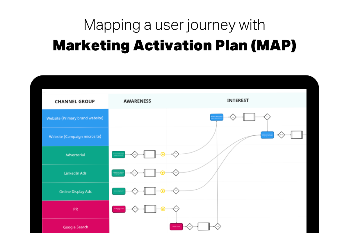
The output of a MAP is a visual summary of a customer's journey as they interact with your brand touchpoints throughout a marketing campaign. An example MAP looks something like the image below.
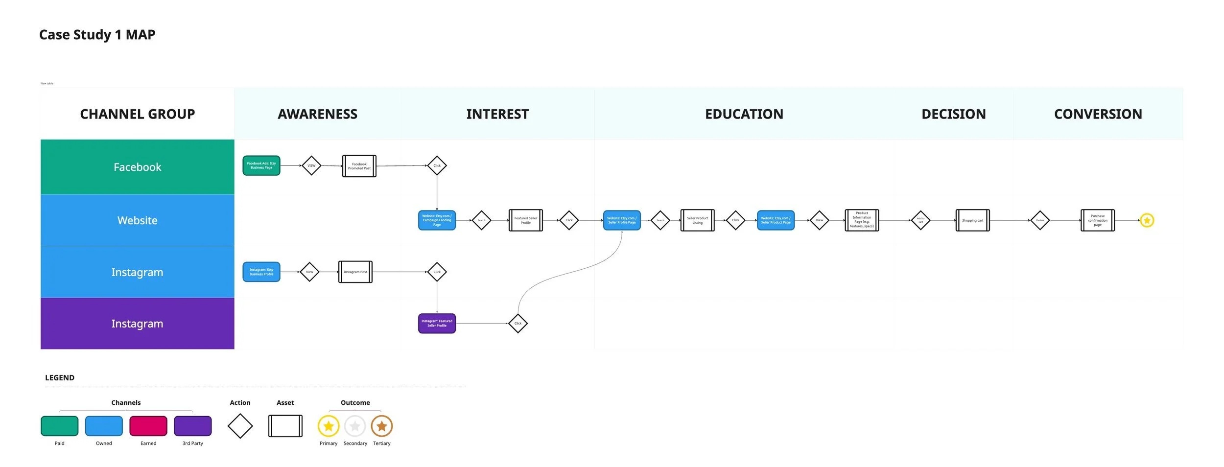
Example Marketing Activation Plan (MAP)
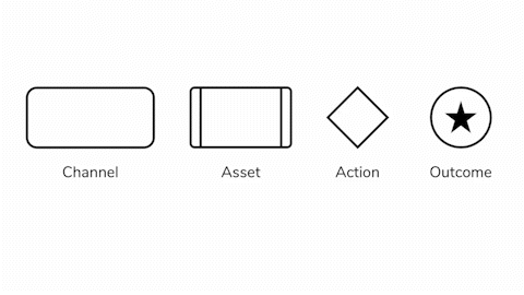
There are four key components used in a MAP.
Channels - These are the places your brand is active and where you promote your brand and engage with customers and prospects. These can be online (e.g. website) and offline (e.g. outdoor display banner) channels.
Assets - Assets are housed within channels and represent the core pieces of content that you create to reach, engage and convert customers. Assets can be anything from a Facebook Post, to a website banner, to a product video, or even a blog post. Naturally, even simple campaigns can feature an enormous body of content, so the objective here isn't to include everything. Instead, you want to think of the essential pieces of content (i.e. assets) on each channel you have developed to achieve your campaign objectives.
Actions - Actions denote the behaviour we expect a potential customer to take when exposed to and engaging with one of your assets. These actions will, in turn, help identify meaningful metrics. For example, say your campaign asset is an article about your product benefits. In this case, the desired action is for your prospects to read the article. So now we know we'll need a metric (or metrics) that can't help quantify engagement with the content (i.e. reading an article). Some example metrics could include time spent (on-page) and page-scroll depth.
Outcomes - Finally, outcomes show us where and when a specific business objective has been achieved. Despite what some approaches and templates may suggest, customer journeys aren't linear. And some campaigns will have multiple business objectives (e.g. product awareness as a primary objective with lead-gen as a secondary objective). As a result, indicating when an outcome has been reached helps you understand how your various marketing channels fit together to achieve your goals.
There's an important relationship between these four components. For example, a campaign is comprised of one or many channels that are used to reach, engage and convert customers. These channels house content assets (e.g. text, images, videos, etc), created to educate, inform or inspire your prospects. And to engage with these assets, your customers will need to take a desired action which progresses them toward an outcome aligned with your business objectives.
Relationship of MAP components
What's the benefit of a MAP?
A MAP should, ideally, be created early in your campaign planning process, as it will help you understand how your campaign channels and assets work together. Furthermore, creating a MAP can help you identify essential measurement opportunities that will allow you to track and monitor your campaign performance more effectively.
You can learn more about the benefits of building a MAP, see step-by-step instructions, and easily duplicate the template for your own use over at the Miroverse. Good luck!
